The Knot :: Playful Palette

Last year one our good friends, Jove Meyer of Jove Meyer Events, reached out with a very exciting opportunity. He would be styling a shoot for The Knot and asked Swiss Cottage to create the paper goods for the event. Once he described his vision – bright colors, fun patterns, and bold shapes – we were in!

Jove and all of the other contributors did a truly amazing job pulling everything together. We were so excited to see the photos after the shoot and waited to share them with bated breath. After much anticipation, the time has finally arrived!

Everything came together so beautifully. It’s a great example of how bold design elements can be combined to create a refined and elegant look. The table setting is my personal favorite – everything is unique in its own right without needing to compete with the other pieces.

TheKnot_1

TheKnot_2

TheKnot_3

A huge thank you to Jove for making it happen as well as to all of the talented contributors!

Planner + Designer – Jove Meyer Events
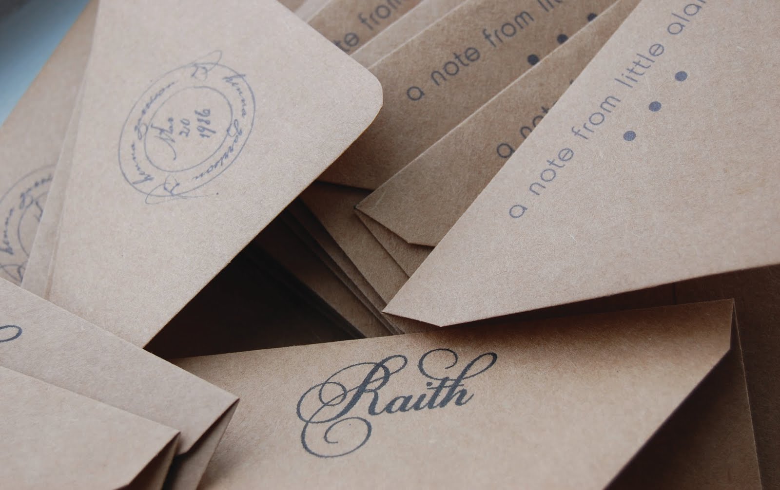
Stationery / Menus + Programs + Place mats + Invites + Save the Dates + Charity Signs – Swiss Cottage Designs
Flowers – Lindsay Rae Design
Vintage Glassware – Little Vintage Rentals
Furniture Rentals / Table + Chairs – Taylor Creative
Tabletop Rentals / Linens + Cutlery + Chargers + China – Broadway Party Rentals
Custom Hand Decorated Shoes – Hushed Commotion
Custom Made Suit – A Suit That Fits
Cake – Lael Cakes

Stuff We Love: Album Artwork

Whenever I’m on the subway in the morning, headed to the studio, I like to look around and see how many of my fellow passengers are reading actual, paper books as opposed to tapping away on a phone or tablet screen. More often that not, the latter will be the majority. Sometimes I’m even one of them (have you guys tried this game called Two Dots??)

It’s undeniable (and also rather old news) that we live in a digital world. From our iPhones and MacBooks to Twitter and Instagram, it’d be nearly impossible to ignore or reject the fact. Nor would we want to! Technology helps us be more efficient in our research, design, and communication. It helps us connect with all of you!

But as custom stationers and lovers of all things tactile, we find even more joy in the physical – things like thick paper, bright ink, paper to-do lists, new pens, old books…and album artwork.

One of my favorite things to do on the weekend is head to a record store (there are no shortage of those in Brooklyn) and flip through the albums. I buy a few here and there, but I more so go to appreciate that, despite music so often being streamed or enjoyed digitally, record covers are still such key a part of the album.

I’ve rounded up five of my favorite, illustrative record covers for your enjoyment. BONUS – all of the music inside is fantastic as well. Check them out below…


1099979553

Daniel Johnton has an incredible number of albums, all with artwork he’s created. It’s tough to pick just one, but if I must, it’ll have to be this classic.


jag246.11183

Kreh Mellick created the artwork for Angel Olsen’s latest release. The way she uses shapes together is absolutely fantastic. Check out her website for more…she paints quite a beautiful beard.

Woods-In-Light-and-With-love2

 Brooklyn band Woods’ album artwork is always on point. I love the black and white sketches from their latest release.


ORD-04scan

The simplicity of Julie Byrne’s artwork perfectly reflects her musical style. I love the handmade quality of this album – the seeminly over-inked stamp shapes feels rustic and warm.

tumblr_static_saintseneca_last

Similar to Angel Olsen’s album, Saintseneca’s artwork is like an exercise in color. It’s great how they’ve created depth and texture from only tones of blue here.

What are some of your favorite album covers? I’d love to see (and listen) to them! Let me know in a comment or tell us on Twitter @swisscottagedsn

SCD Valentine’s Designs for Paperless Post

Happy Monday everyone! January made it’s presence known with a little snow this weekend in NYC. I am looking forward to cozy February when everything is red & pink and just cute enough to make you forget it’s winter. With love in the air I thought I’d share the new Valentine’s inspired designs I created for Paperless Post. The “double the love” design is my fav. I have a few other projects cooking with Paperless Post for the Spring so stayed tuned for those designs soon!

Mustaches Preferred: Thanking you!

Ashley and Chris are less than a month away from their big day. They are busy tying up all the little details before the wedding, one of which is taking care of their thank you notes. We created some fun cards that play off their great invites.  We revisited the mustache and tie combo and added a bowler hat to keep it fancy. I love the date detail on the back, makes it personal. Good luck guys!

Different Strokes…Different Folks

Part of what makes my job so fun is that every person I design for is so different. This client wanted to order some stationery for her employees. I happen to know these special ladies on a personal level so designing for them was easy and really fun. In this group of gals we have a stylish, J.Crew loving college co-ed, a world traveling free spirit and a lovely, spunky Mom of two. Each woman got stationery catered to their personality and I think it shows. Personalized stationery makes a great gift for your friends, family or bridesmaids {hint!}

Garden Love

This custom stationery was done for a client’s mother-in-law as a birthday gift. She is an avid gardener so the client had me do a custom watering can image. I think it’s really sweet and age appropriate. It’s a perfect gift!

Down on the corner…

Jen and Adam are a great couple who live right down the street from me in Williamsburg. They are getting married this August and needed some custom stationery to use as thank you notes. They met over their mutual love for the band Wide Spread Panic so needless to say they are very laid back and fun. We wanted to do something clever that played up their neighborhood {since they just bought their first home together} I decided to draw their street corner, Wythe and North 8th, and make a icon out of it. It was the perfect fit for them.


Getting down to business

Recently I have been working with a client who is a freelancer looking to expand her network in the city. She hired me to create some business cards and stationery to use during this process. The client has a very modern and clean design sensibility. She wanted to use these items for networking but also for personal use. I kept the design very simple and fresh so it translates well in any situation. The main focus is the typography and the pencil thin city scape comes as an afterthought here. I think these are perfect for getting your name out there or sending a thank you note.

‘Cause my baby just a-wrote me a letter

I love that song. Even though the Box Tops sang it first I always think of a sweaty Joe Cocker dancing around singing like his life depends on it. Speaking of sweaty Joe Cocker (nice segue, huh?) I wanted to share some recent custom stationery jobs I have done. The first client is a really fun, outgoing girl with a great sense of humor. I wanted to play that up in her cards with the bird saying “hi”. The second set was done for a little boy who is 100% in love with trains. They were thank you cards for his 5th birthday. Once I realized I could spell the clients name using actual subway letters, the design dictated itself!